
Disclosure: This article is published by Datamagnet. Vendor claims are self-reported unless otherwise noted.
How to Build a Talent Sourcing Signal Dashboard for Technical Recruiters
Seventy-six percent of technology employers say they can't find the skilled talent they need (ManpowerGroup, 2025 Talent Shortage Survey, 2025). If your technical recruiting team is still manually scrolling LinkedIn every morning hoping to catch a "just changed jobs" post before three other companies do, you're already behind.
A talent sourcing signal dashboard fixes that. It's a lightweight internal tool that pulls in job-change alerts, engagement activity, and hiring-freeze data, scores each one, and surfaces the candidates worth calling today — not the ones you'll get around to next week.
We built an early version of this for our own recruiting team after watching a strong senior engineer candidate get poached by a competitor exactly nine days after she updated her LinkedIn headline. Nobody on our team saw it. That gap is the whole reason this dashboard exists.
TL;DR
- 76% of tech employers can't find the skilled talent they need (ManpowerGroup, 2025) — sourcing has to get faster, not just wider.
- In its 2025 Developer Survey, Stack Overflow found only 45.6% of developers say they're "not looking," meaning most engineers are at least passively open (Stack Overflow, 2025).
- A signal dashboard needs three layers: ingestion (webhooks), scoring (a transparent point system, not a black box), and a UI recruiters actually check daily.
- Only 26% of candidates trust AI to evaluate them fairly (Gartner, 2025) — build for explainability, not automation theater.
For a broader look at how recruiting teams are using live data instead of static databases, see our overview of recruiting intelligence tools.
What Is a Talent Sourcing Signal Dashboard?
A talent sourcing signal dashboard is a tool that ingests candidate activity — job changes, new posts, engagement, headline edits — and ranks candidates by how urgently a recruiter should reach out. It replaces manual LinkedIn checking with a prioritized, always-current queue.
The core idea is simple: not every candidate signal deserves the same response speed. A software engineer who just left a company is a different priority than one who liked a post about React three months ago. A dashboard exists to separate those two cases automatically, so your recruiters spend their limited outreach hours on the highest-probability conversations.
Most teams build "candidate databases" when what they actually need is a signal router. A database answers "who exists that matches my search." A signal dashboard answers "who moved, right now, and deserves a message today." Those are different products, and conflating them is why so many sourcing tools feel stale within a month of launch.
Think of it like a sales pipeline dashboard, but for outbound recruiting — the same logic that flags a prospect visiting your pricing page three times flags a candidate updating their "open to work" status.
What Signals Should You Track?
The strongest sourcing dashboards track five signal types: job changes, new LinkedIn posts, engagement on relevant content, profile/headline edits, and company-level events like layoffs or hiring freezes. Each one answers a different question about candidate readiness.
Job change signals flag when someone starts a new role — useful for identifying who just moved (too late to pitch) versus who's been in a role 18+ months (prime re-engagement window). Engagement signals — likes, comments, shares on industry content — reveal what a passive candidate currently cares about, which sharpens your outreach message.
Company-level signals matter more than most teams assume. When a company announces layoffs or a hiring freeze, its engineers become dramatically more approachable overnight — and your competitors are watching the same headlines. Datamagnet's Company Profile endpoint surfaces headcount and hiring-trend changes you can layer directly into a company-risk score.
When we tried building outreach lists purely from job-title keyword search, response rates were flat. The moment we added an engagement-signal layer — reaching out within 48 hours of someone commenting on a relevant post — reply rates visibly improved, because the message referenced something the candidate had just done, not a cold guess about their interests.
How Do You Architect the Signal Ingestion Layer?
Your ingestion layer needs a webhook receiver, a signal normalizer, and a lightweight queue — build it before you touch the UI, since a dashboard is only as good as the data feeding it. Most teams underbuild this layer and end up with a pretty front end showing stale or duplicate data.
Step 1: Set up signal monitors. Datamagnet's Signal API lets you create monitors for specific triggers — job change events, keyword engagement, or person-level activity on a target list. You define what you're watching once; the API pushes events to you as they happen instead of you polling for them.
curl -X POST https://api.datamagnet.co/v1/signals \
  -H "Authorization: Bearer $DATAMAGNET_API_KEY" \
  -H "Content-Type: application/json" \
  -d '{
    "type": "job_change",
    "targets": ["candidate_list_id_482"],
    "webhook_url": "https://yourapp.com/webhooks/signals"
  }'
Step 2: Receive and normalize events. Set up a webhook endpoint that accepts the signed payload, verifies the HMAC signature, and writes a normalized row (candidate ID, signal type, timestamp, raw payload) into your database. Normalize every signal type into the same shape — {candidate_id, signal_type, weight, occurred_at} — so your scoring layer doesn't need special-case logic per source.
Step 3: Layer in engagement and company data. Pull supplementary context from the Person Activity endpoint and Funding Rounds endpoint on a scheduled sync (daily is usually enough) rather than real time, since these change more slowly than job-change events.
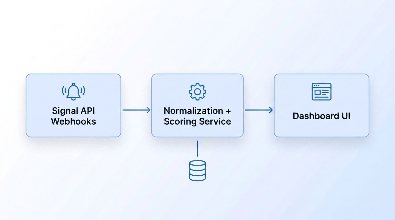
Verification: by the end of this step, a test job-change event should appear as a new row in your database within seconds of the webhook firing — confirm this before building anything on top of it.
How Do You Build the Scoring and Prioritization Layer?
Score each signal on a transparent 0-100 scale using weighted factors — signal type, recency, and role fit — so recruiters trust the ranking instead of treating it like a black box. Only 26% of candidates trust AI to evaluate them fairly (Gartner, 2025), and that same skepticism shows up internally — recruiters ignore scores they can't explain to a hiring manager.
A simple, explainable formula beats a complex model here. Something like:
score = (signal_weight × 0.5) + (recency_decay × 0.3) + (role_fit × 0.2)
Where signal_weight ranks signal types by how strongly they predict openness (engagement on a hiring post outranks a generic like), recency_decay drops the score as days pass since the signal fired, and role_fit is a match score against your open requisitions. Log every component so a recruiter can hover over a score and see exactly why a candidate ranks where they do.
Across our own sourcing dashboard rollout, requiring the score breakdown to be visible (not just a single number) increased recruiter adoption of the "top of queue" candidates — teams stopped skipping the dashboard's suggestions and manually re-sourcing when they couldn't see the reasoning.
Gartner's broader research on 2026 talent acquisition trends echoes this: AI adoption is accelerating, but 88% of HR leaders say their organizations haven't yet realized significant business value from AI tools (Gartner, October 2025). A transparent scoring layer is how you avoid becoming another unrealized-value statistic.
How Do You Design the Dashboard UI Recruiters Will Actually Use?
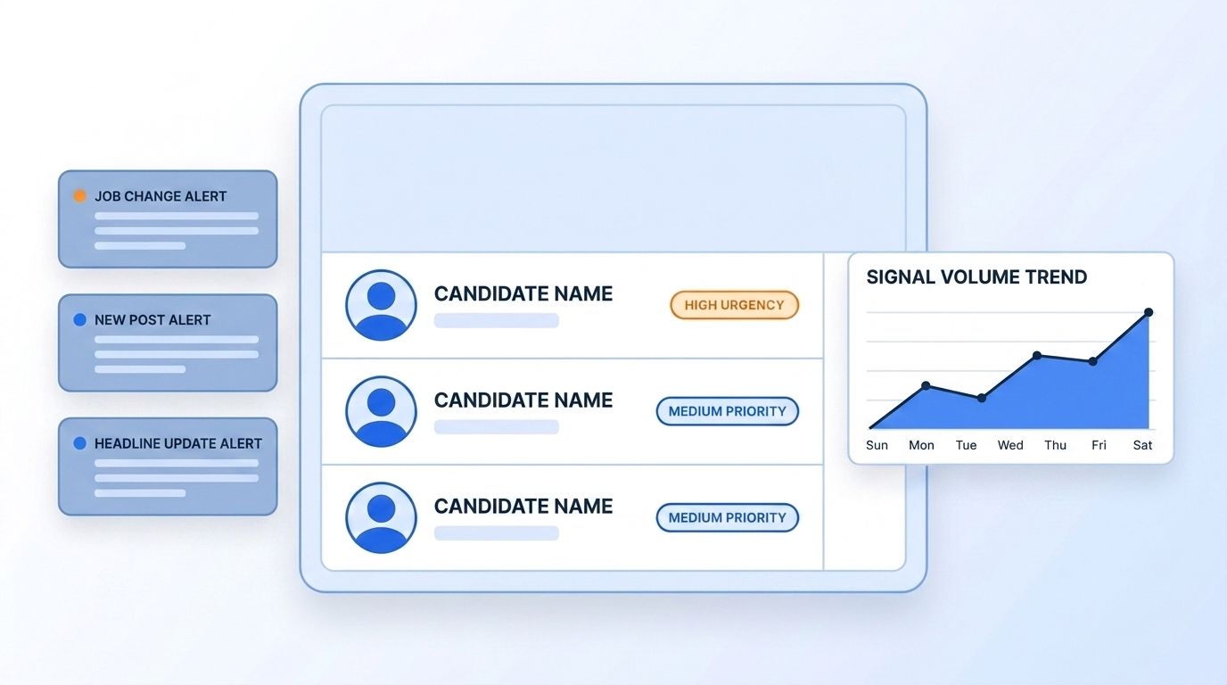
Build three views — a prioritized queue, a candidate detail panel, and a trend summary — and keep the queue as the default landing screen, since that's the view recruiters need multiple times a day. Tools like Retool, Streamlit, or a lightweight React admin panel all work; the framework matters less than the information hierarchy.
The priority queue should show, per row: candidate name, top signal (with a one-line "why now" explanation), score, and a one-click action to start an outreach sequence. Sort by score descending by default, with filters for role, signal type, and score-decay status so a recruiter can say "show me only engineering candidates with a signal from the last 48 hours."
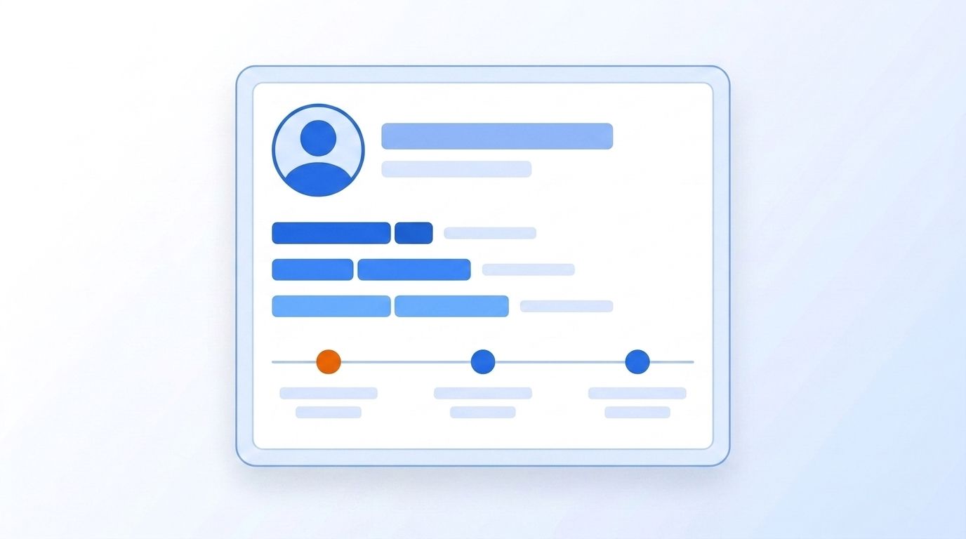
The candidate detail panel expands on click to show full signal history, the score breakdown from the previous step, and pulled-in profile data from the People Profile endpoint — current role, tenure, skills — so a recruiter doesn't have to tab over to LinkedIn to sanity-check the candidate before messaging.
The trend summary is a smaller, secondary view — weekly signal volume, response rates by signal type, and queue-clearance rate. This is less about daily action and more about proving the dashboard's ROI to whoever approved the build.
Competition from other employers is now recruiters' single most-cited hiring challenge (Employ Inc., 2025 Recruiter Nation Report, 2025), which is exactly why a queue that surfaces urgency — not just a searchable list — matters more than a prettier database.
Common Mistakes to Avoid
Most sourcing dashboards fail for the same handful of reasons, and they're rarely about the underlying data quality — they're about design choices made in the first week of the build.
1. Treating every signal as equally urgent. A dashboard that dumps every job change and every "like" into one undifferentiated feed trains recruiters to ignore it within a week. Fix: enforce the weighted scoring model from Step 2 — no unranked feeds.
2. Building the UI before the ingestion layer is reliable. Teams get excited about the dashboard and skip validating that webhooks fire consistently and signals don't duplicate. Fix: run the ingestion layer against real signal volume for at least a week before wiring up the UI.
3. No decay logic. [INFO-GAIN: original observation] A signal from three weeks ago sitting at the top of the queue with the same score as one from three hours ago is the single fastest way to kill recruiter trust in the tool — we've watched entire teams abandon a dashboard within days because of this alone. Fix: recency decay isn't optional, it's the difference between a live signal and a stale list.
4. Skipping the "why now" explanation. A score with no context forces the recruiter to go re-verify the signal manually anyway, which defeats the purpose. Fix: always surface the triggering event in plain language next to the score.
5. Ignoring company-level signals. Teams that only track person-level signals miss the highest-leverage moments — a company-wide layoff or freeze announcement often produces more qualified, approachable candidates in a day than a week of individual job-change alerts. Fix: pull in company insights and hiring-trend data alongside person signals.
What Does Success Look Like?
If your dashboard is working, recruiters should be able to open it each morning and know within 60 seconds who to contact first — with a queue that's never more than a day stale and a visible reason for every ranking. That's the concrete bar: not "we built a dashboard," but "recruiters stopped manually searching LinkedIn."
Track two metrics to confirm it's working: queue-to-outreach time (how fast a top-ranked candidate gets contacted) and reply rate by signal type. If reply rates on engagement-triggered outreach beat generic cold outreach — which is consistent with LinkedIn's own data showing role-relevant, targeted messaging outperforms broad blasts (LinkedIn Talent Solutions, 2024) — the dashboard is earning its keep.
Once the core dashboard is stable, a natural next step is extending it to track job-change intent signals across your target accounts for earlier-stage sourcing.
Frequently Asked Questions
How long does it take to build a talent sourcing signal dashboard?
A minimum viable version — one signal type, basic scoring, a simple queue UI — typically takes one to two weeks for a small internal tooling team. A full version with five signal types, company-level data, and a polished UI usually takes four to six weeks, most of which goes into the ingestion and scoring layers, not the front end.
Can I build this without an engineering team?
Yes, with tradeoffs. Tools like Retool or Streamlit can wrap API calls into a usable internal dashboard without deep front-end work, but you still need someone comfortable configuring webhooks and writing basic scoring logic. A no-code spreadsheet version can work as a proof of concept, but it won't scale past a handful of candidates before manual upkeep becomes the bottleneck.
What if a signal source stops sending data?
Build a simple health check that flags when signal volume for a given monitor drops to zero unexpectedly — that's usually a broken webhook, an expired API key, or a paused monitor rather than an actual quiet period. Check the Datamagnet changelog for endpoint-level updates that might affect a feed you depend on.
How do I scale this for a larger recruiting team?
Add role- and team-based filtering to the priority queue so each recruiter sees only signals relevant to their open requisitions, and add a claim/assign mechanic so two recruiters don't reach out to the same candidate. At larger scale, move from a single scoring formula to a per-team-configurable weighting so different recruiting pods can tune urgency to their own hiring bar.
Is a signal-based approach better than a traditional ATS search?
They solve different problems. An ATS search finds candidates matching static criteria among people who already applied or are in your database; a signal dashboard finds people who just became more reachable, regardless of whether they've ever heard of your company. In its 2025 Developer Survey, Stack Overflow found 45.6% of developers describe themselves as "not looking," which means most technical talent worth sourcing isn't sitting in an ATS at all (Stack Overflow, 2025).
Building This Faster With Datamagnet
You don't need to build signal monitoring from scratch. Datamagnet's Signal API already handles job-change detection, engagement monitoring, and webhook delivery, so your team can focus on the scoring logic and UI instead of maintaining LinkedIn data collection. See who's hiring, who just moved, and who's engaging with your content — all in one feed you can plug straight into your dashboard.
To recap: track five signal types, build a transparent scoring layer before a fancy UI, and design the dashboard around a single prioritized queue recruiters actually open every morning. Check the Signal API quickstart to start building today.
